
By Maria Wiering
mwiering@CatholicReview.org
Twitter: @ReviewWiering
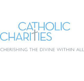
Catholic Charities of Baltimore announced the launch of a new logo Sept. 12 that will be used in the agency’s fall advertising campaign and visible on billboards Sept. 16.
The logo features the words “Catholic Charities” in a bright-blue-and-gray sans serif font, with the tagline “Cherishing the Divine Within All.” The “t” in “charities” doubles as a cross, and “all” is a new addition to the agency’s tagline.
More than a decade old, the previous logo included maroon lettering with an encircled image of a loaf of bread and two fishes.
The new look serves to “remind us and to remind others, particularly the public, that we cherish and recognize the divinity and dignity of each person,” said William J. McCarthy, Catholic Charities’ executive director.
The Catholic Review asked McCarthy to explain the agency’s fresh image. The interview has been edited for length and clarity.
Q. Why launch a new logo now?
A. As we looked at the logo that we’ve had for so long, and we’ve looked at the evolution of the work of the agency, we felt it was time to really refresh the brand. The loaves and fishes that were part of our logo previously connoted what we did at our core with the opening of Our Daily Bread almost 33 year ago of feeding the hungry. Catholic Charities does so much more today. We thought it was time to go back and remind people not only what we do, but why we do what we do, and how we go about our work.
Q. Unlike the old logo, the new logo doesn’t say “Catholic Charities of Baltimore.” Why is that?
A. We do have a secondary brand “of Baltimore,” but the service area of Catholic Charities is the entire Archdiocese of Baltimore. For people out in Western Maryland, we want our brand and our logo to be inclusive of all areas.
Q. What do you hope people who are not familiar with Catholic Charities’ work take away from seeing the new logo?
A. We serve all. Catholic Charities is an inclusive organization in how we go about our work – not only who we serve, but who volunteers and who works at Catholic Charities. Our work is really grounded in the teachings of Jesus Christ and our Catholic identity. We don’t serve Catholics, but we serve others because we’re rooted in the teachings of the church.
Q. Why is it good to refresh your agency’s image periodically?
A. With all things, brands and logos get stale. That kind of image of the agency has been around for such a long time, but over the years the agency has changed greatly in terms of our presence, in terms of the services we provide, and in terms of our size, depth and scope. The new logo should remind and call people’s attention to what Catholic Charities is today – who we are as an agency and the services we offer to all.
Also see: